WORK

WISCONSIN DEPARTMENT OF PUBLIC HEALTH TOGETHER TO BETTER ART DIRECTION
Together to Better is the brand message developed to champion the ideals of collaboration and the idea that mutual support and cooperation is key to a functioning and healthy public health department. The logo design for the campaign stresses the throughline, connecting each word visually but also metaphorically representing the conceptual elements and guiding principles that run through all of the work DPH does. Together to Better is a rallying call that the Wisconsin Department of Public Health can use to unify the vast array of unique individuals who are each part of departments with their own specialized focus, and that this collective effort contributes to the health and wellbeing of the whole community.

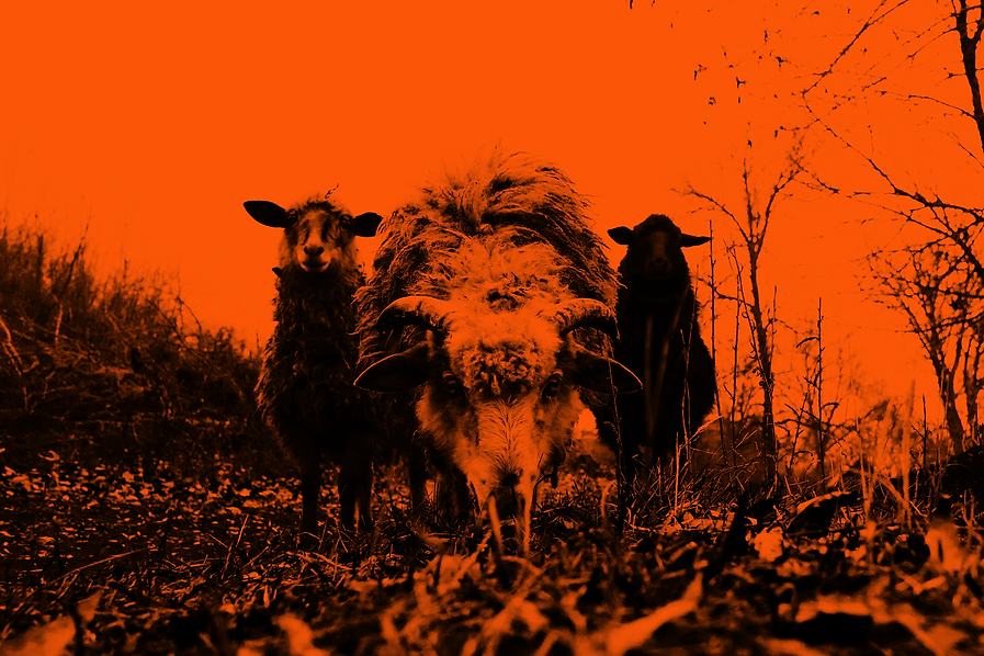
SURREAL SIPS SELTZERS & DRINK ELIXIRS
Surreal Sips is a non-alcoholic elixir that provides a high-quality base for unique spiritless cocktails. The brand and visual identity communicate choice, exploration, and community that the product has to offer. Surreal Sips utilizes a surrealist visual aesthetic, with abstract illustrations of an imagined dream space and a lone boater traveling through it. Over time, the base flavors were combined with THC & CBD extracts, soda water, and fruit juices to create canned cocktail variations of the original flavors. The alien landscape I had developed for the original bottle illustrations changed from vectors to photo-realistic illustrations utilizing deep black and tropical color overlays reminiscent of tiki bars from far off worlds or in one’s dreams.
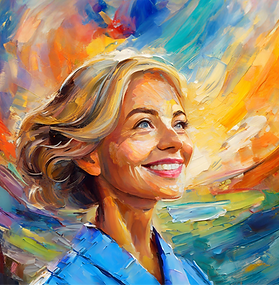
WISCONSIN DEPARTMENT OF CARE & TREATMENT SERVICES NURSING RECRUITMENT CAMPAIGN ART DIRECTION
The Wisconsin Depart of Care and Treatment Services (WIDCTS) wanted to expand their nursing recruitment to surrounding Midwestern states. As part of the Kane team, I developed the visual aesthetic for the campaign. This consisted of multiple original illustrations in the style of heavily-painted acrylic abstract portraits developed to represent the audiences we were trying to reach using a combination of Adobe Firefly generative AI and Photoshop manipulation. My art direction on this project allowed potential applicants to envision themselves “painting” the future they want as a WIDCTS nurse, with a rewarding career path in a state burgeoning with picturesque scenery and cities on the rise.

GHOST HAND
Ghost Hand is my personal lifestyle brand that blends my love for cartoons, horror films, and pop culture. I make original collage work, unique digital prints using specialized techniques, hand screen-printed t-shirts, vinyl sticker packs, bumper stickers, buttons, bottle opener key chains, and found object sculptural pieces I paint myself. The brand represents the idea that my Artistic hand functions on its own and interacts with the world in the form of Ghost Hand, that part of myself that interprets and re-contextualizes the world around me through design, illustration, and any other visual expression I choose to explore.

MESSMER HIGH SCHOOL BRAND IDENTITY
Messmer High School is a 100 year old Catholic High school in Milwaukee, WI. Formerly Messmer Catholic Schools, the institution was undergoing changes to transform from a K-12 education to a high school only. The high school building has existed in the same location since its founding a century ago in 1926, with unique architectural elements reminiscent of belfry and watchtower motifs. These architectural elements reveal the aspirational atmosphere, sanctuary, and shepherding guide that Messmer High School provides for young members of the Milwaukee community. The Messmer athletics brand logo was lightly redesigned to unify it aesthetically as a Messmer High School sub-brand. Brand guidelines were also developed to illustrate physical and digital brand applications, brand assets for use, and a general visual aesthetic style guide.
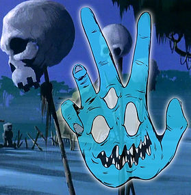
ILLUSTRATION & ART
As an Illustrator and Artist I am academically trained and culturally influenced. In 2012 I invented the Ghost Hand moniker as a way to explore my personal psyche and reality, an artistic identity that suggests and stresses the influences of play, memory, mimicry, and re-contextualization in the work I create. I treat Ghost Hand as a living entity and I have captured his visage a multitude of
times across various mediums. The character visually manifested itself as a dismembered human hand, the ever present invisible hand influencing my illustrations and artistic endeavors. Although, at times the characters I illustrate often have a real referent in pop culture or storytelling, they are decidedly the work of Ghost Hand.